Change is in the air here at Upopolis! We’re thrilled to unveil our refreshed brand identity, marking a new chapter in our 17 year journey.
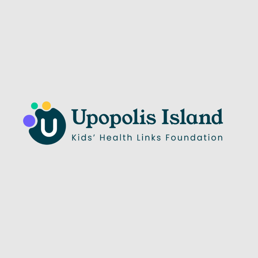
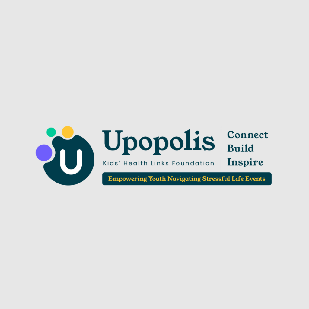
A brand refresh isn’t just about updating visuals; it’s a bold statement of where we’ve been, and where we’re going. Ultimately, it’s our commitment to staying relevant with the teens and young adults who use our website, and the professionals who refer them to us. Our new logo is a representation of our dedication to connection. The three dots symbolize individuals coming together through our Islands and the larger Upopolis community.
Why the change? As we grow and adapt to new challenges and opportunities, we recognize the importance of aligning our brand with our vision for the future. This brand refresh is a reminder that Upopolis is a trusted and empowering online community for youth facing stressful life events, including grief and medical challenges. Upopolis is a safe space for connection, support and empowerment, with the goal of reducing social isolation and fostering resilience.
What can you expect? Beyond a fresh look, we are shifting our target audience to youth aged 13 to 23 across North America. We will continue to raise awareness about our free-of-charge programming to patients, parents, siblings and health professionals in this catchment area. Look out for our updated website which will be more user-friendly, resource-heavy, and an easy place to guide patients, parents and health professionals to find out more about Upopolis. Website updates will be announced in the coming months!
Thank you for being part of our story. We invite you to explore our new look, connect with us, and join us on this exciting journey forward. Together, let’s embrace change and write the next chapter of success for Uopolis!
Here’s to new beginnings and endless possibilities!